- User Research
- In-depth Interview
- Issue Tree
- Desk Research

JAKTRANS
Abstract
In this case study, I am required to create a digital platform that will be used by public transportation users in Jakarta. The primary objective is to address the challenge of ensuring seamless access to essential information such as schedules, routes, and the real-time locations of public transportation vehicles. By providing a user-friendly interface and incorporating features like real-time tracking, route planning, and timely updates on schedule changes or disruptions, the platform aims to enhance the overall commuting experience for Jakarta's residents and visitors. Additionally, leveraging mobile compatibility and possibly integrating with existing transportation systems can further streamline accessibility and usability, ultimately contributing to improved efficiency and convenience in navigating Jakarta's public transportation network.
Introduction
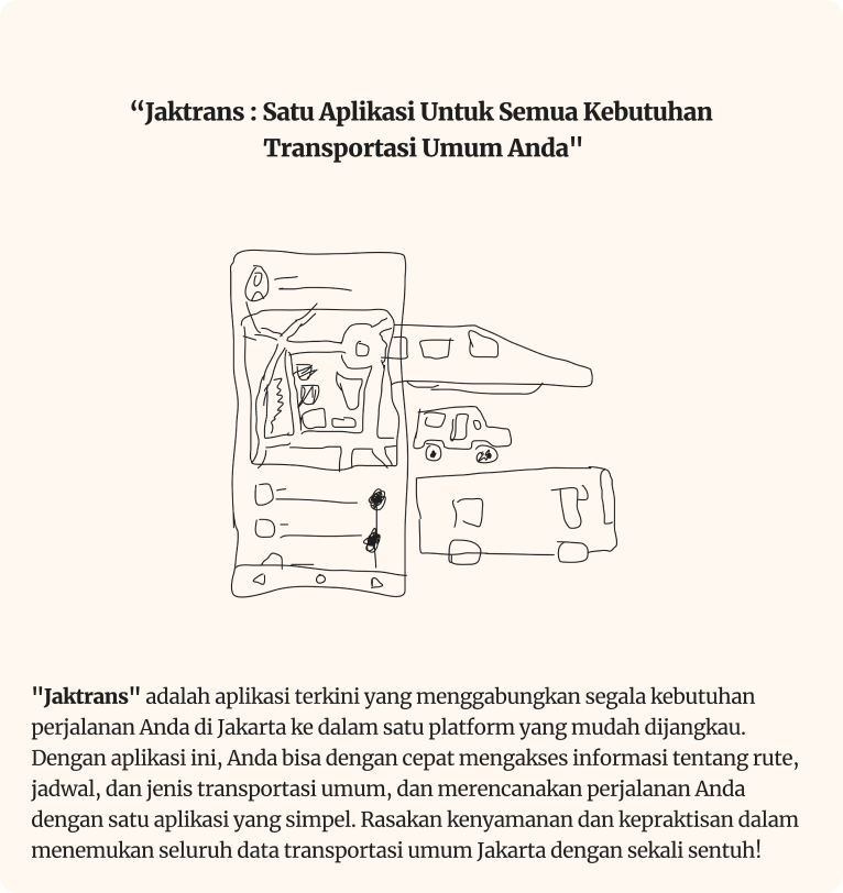
"JakTrans" is the latest application that integrates all your travel needs in Jakarta into one easily accessible platform. You can quickly access information about routes, schedules, and types of public transportation, and plan your journey with a simple application. Experience the comfort and convenience of finding all Jakarta public transportation data with just one touch!
Duration
16 Weeks
The Team
Muhammad Hafiz Hisbullah
Tools
- Figma
- Figjam
- Visual Studio Code
- HTML
- Tailwind
- Javascript
- ReactJs
- Spreadsheet
My Role
- UX Designer
- UX Researcher
- UX Writer
- UI Designer
- Frontend Developer
Objectives
"Developing a mobile app-based platform so that public transportation users in Jakarta can comfortably access integrated service information."
As a Product Designer, my role involves understanding and addressing the needs of public transportation users, enabling them to access all public vehicle information in Jakarta through a single application.
Discover
Transportation can be defined as the effort and activity of carrying or transporting goods and/or passengers from one place to another (Sugianto, 2020). Currently, public transportation services available in Jakarta, such as Transjakarta, Commuterline, MRT, and others, are provided by the government. People can enjoy these facilities to reach their destinations. For example, if we live in Jakarta and want to travel to Bogor Botanical Gardens, we can use public transportation like the Commuterline to Bogor station, then continue by taking an angkot (public minivan) towards Bogor Botanical Gardens.
Data from the Central Statistics Agency (BPS) in 2019 showed that the average daily passengers of the Jabodetabek Commuterline were 900 thousand, while for Transjakarta, data obtained from the Transjakarta public information service (PPID) in 2019 stated that the daily passenger data for all corridors was 735 thousand. Since the operation of public transportation in Jakarta, several problems and criticisms have arisen. One of the problems experienced by the public and public transportation users is the difficulty in accessing information and routes between public transportation modes.
Data from the Central Statistics Agency (BPS) in 2019 showed that the average daily passengers of the Jabodetabek Commuterline were 900 thousand, while for Transjakarta, data obtained from the Transjakarta public information service (PPID) in 2019 stated that the daily passenger data for all corridors was 735 thousand. Since the operation of public transportation in Jakarta, several problems and criticisms have arisen. One of the problems experienced by the public and public transportation users is the difficulty in accessing information and routes between public transportation modes.
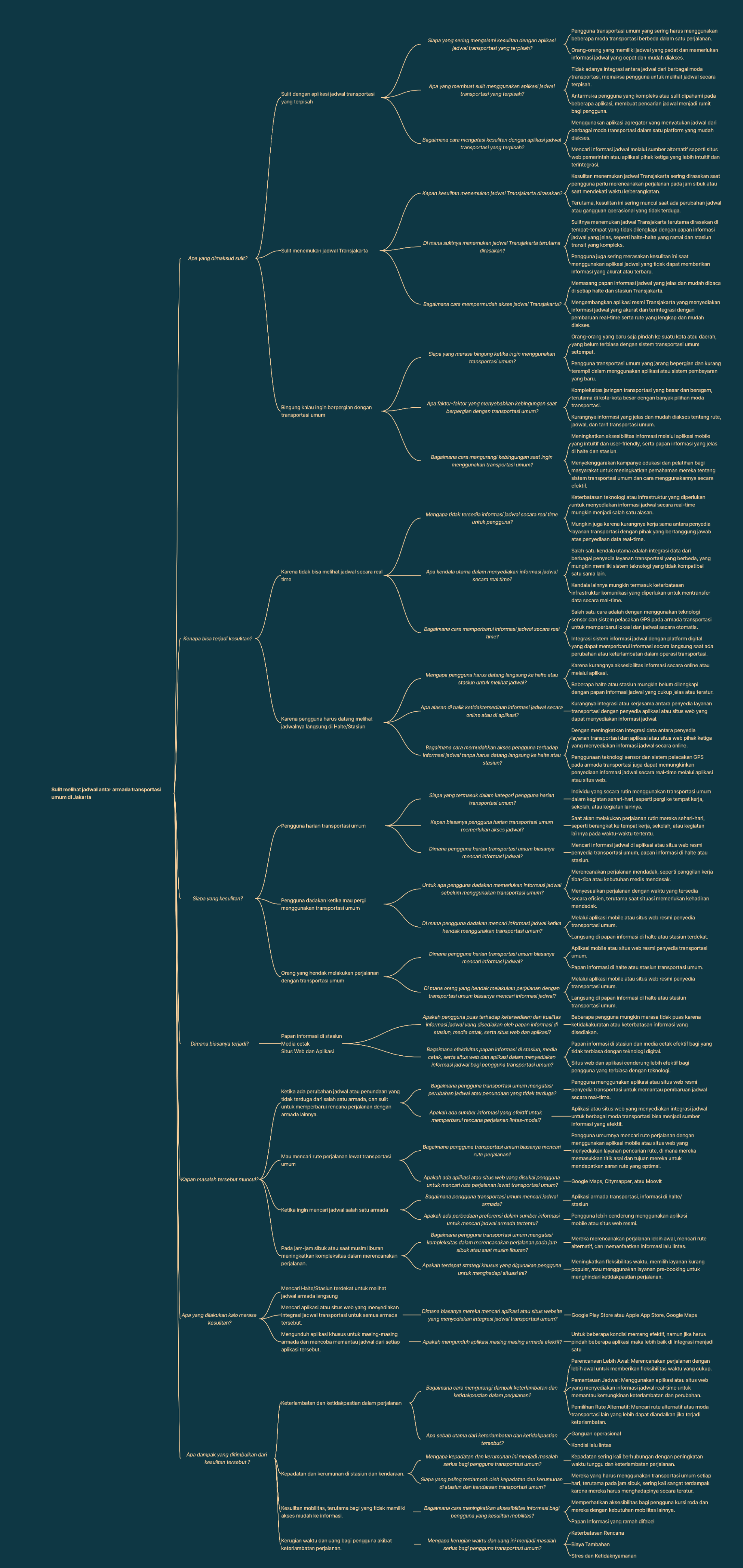
Issue Tree
To assist in problem-solving in a structured and systematic way, we use the Issue Tree framework. We start with a simple statement: "Public transportation users find it difficult to see schedules between different fleets (Transjakarta, Commuterline, LRT, MRT)."
Defining Users and Research
To gather insights into the challenges faced by public transportation users, we sat down with a variety of individuals and had conversations with them. It was a fascinating experience because we got to interact directly with them, listening to their stories and understanding their perspectives firsthand.
The Habbit
- Often, people using public transportation without checking schedules increase the risk of queues at stops/stations
- Users switching between public transportation modes find it difficult because route information is scattered across different applications
- People tend to waste time on the road due to not knowing public transportation schedules.
The Scope
- Women and Men
- 3 Participants
- Aged 17 - 40
- Residing in Jabodetabek
- Students and Workers
- Have used public transportation
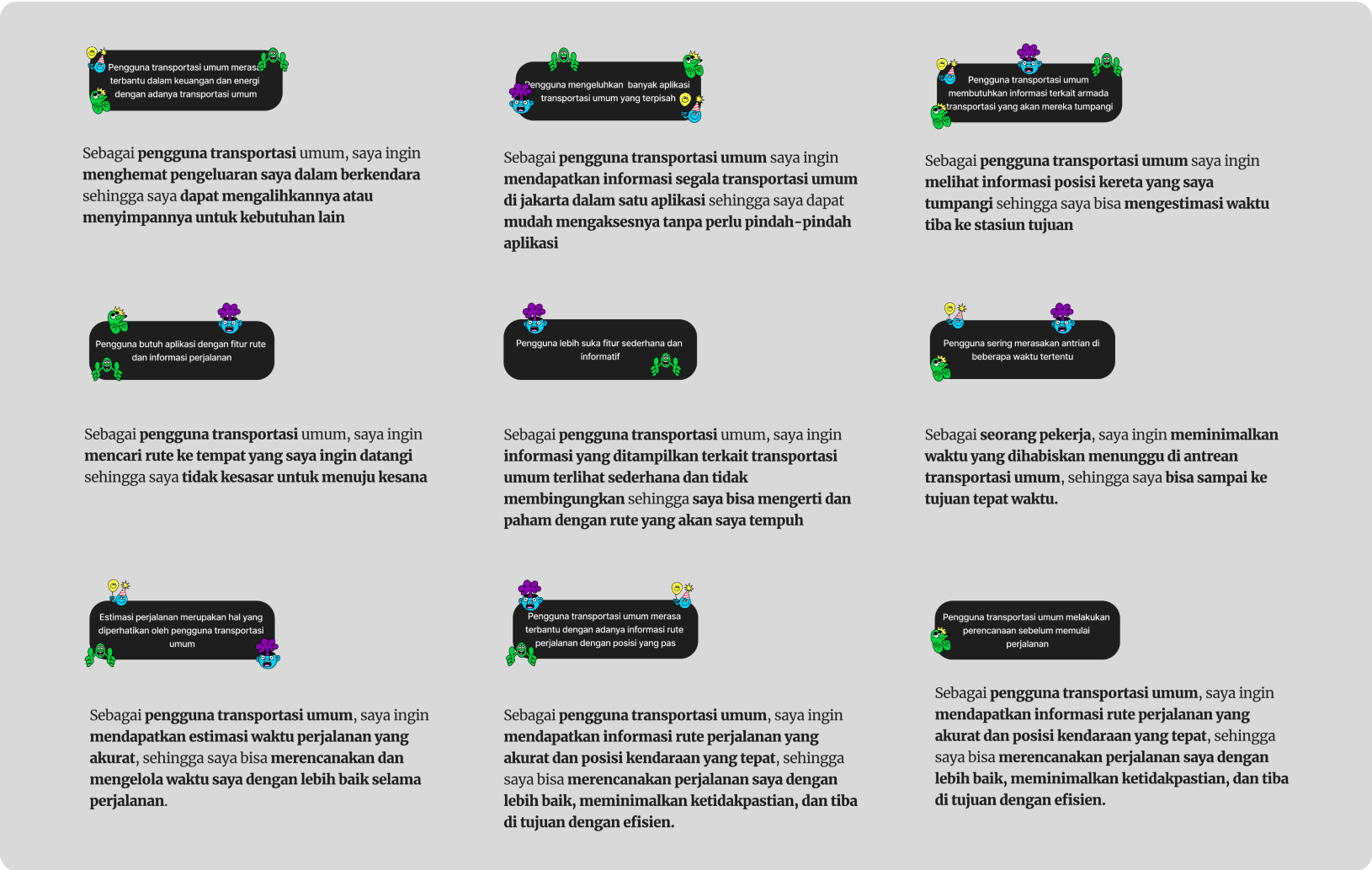
Let’s “Grouping” and Making the “Mandates”
The grouping I conducted involved analyzing the responses of the interviewees, identifying recurring patterns, and then using those patterns to generate design mandates. These design mandates serve as guidelines for creating solutions or improvements based on the needs and preferences expressed by the participants.
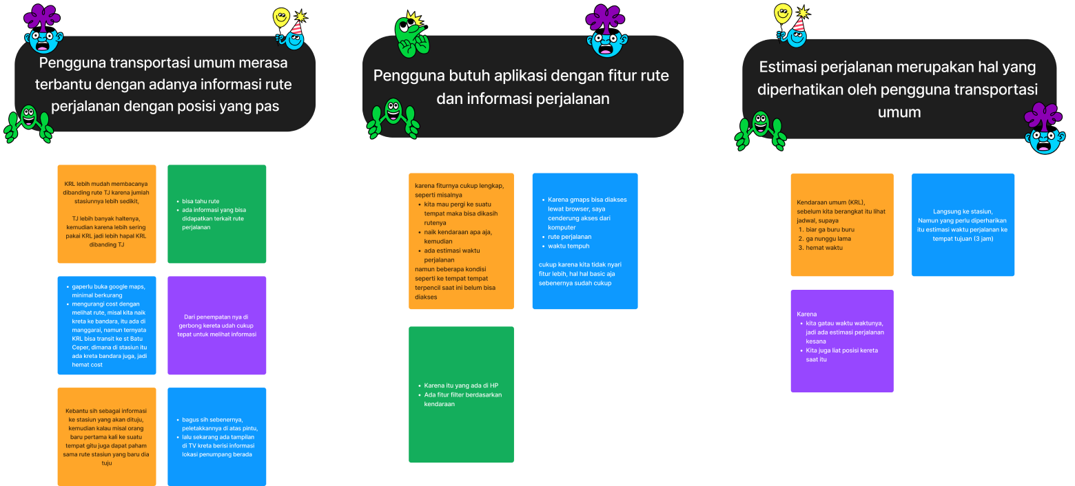
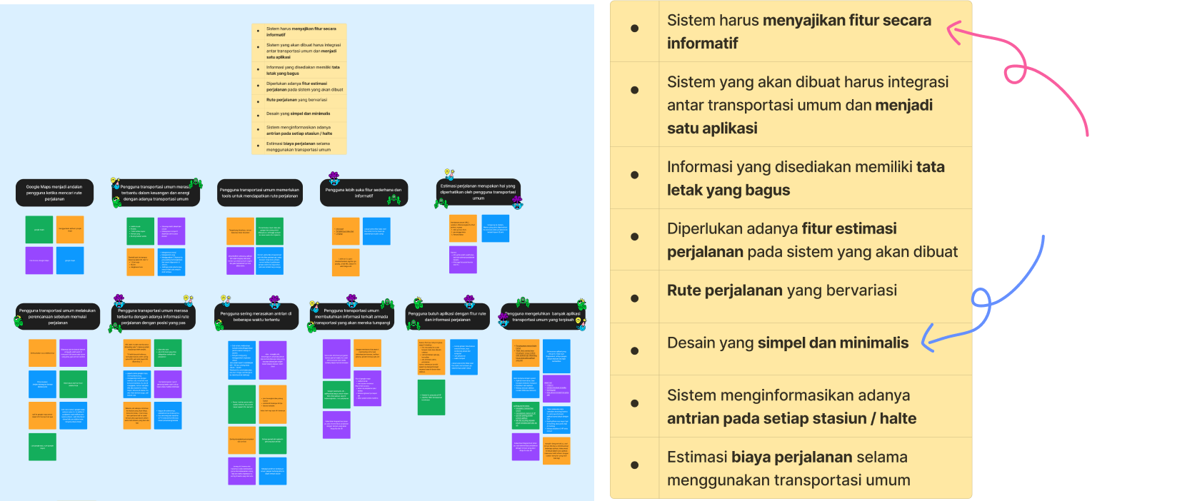
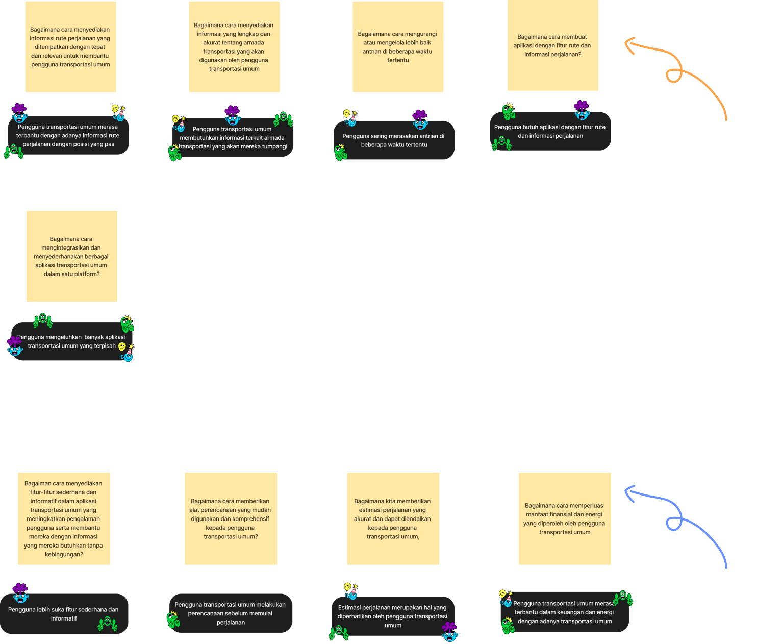
Grouping and Design Mandates have been completed, so the next step is to separate the patterns that become problems or insights. This is done to identify the actual issues that users experience when using public transportation. The patterns categorized as "problems" will serve as benchmarks for creating solutions in the application later on. For example, one issue I found is users complaining about the fragmentation of many separate public transportation applications. Therefore, I'll turn it into a "How Might We" question. Similarly, patterns categorized as "Insights" include simplicity of features, travel time estimation, and users feeling financially assisted by effective route planning.
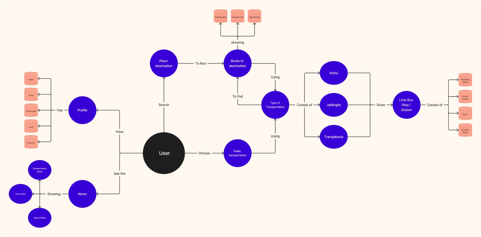
Build the "Concept Model"
Before creating the concept model, I made scribbles about the application to be developed. The data used came from previous research and had been processed into design mandates containing user issues when using public transportation. They want easy access to information about routes, schedules, and types of public transportation, as well as planning their journey. Comfort and convenience are something they expect.
The purpose of developing a Concept Model is to provide a comprehensive understanding of the application's functionality, the features it will offer, and how users will engage with it.
Jobs To Be Done
As a designer, I strive to empathize with what users experience when using public transportation so that I can find optimal solutions. I understand that by using the Jobs To Be Done (JTBD) framework, I can adopt the user's perspective as if I were a public transportation user myself.
User Flow & Information Architecture
I delve into crafting the user flow for the application. Understanding the frustrations and needs expressed by users, such as the hassle of dealing with multiple transportation apps, I aim to streamline their journey with a seamless and intuitive user experience.
Starting from the point where users open the application, the user flow will guide them through accessing essential information like route options, schedules, and types of transportation available. Simplifying the process of planning their journey will be a priority, ensuring that users can effortlessly find the most efficient routes and estimated travel times.
Starting from the point where users open the application, the user flow will guide them through accessing essential information like route options, schedules, and types of transportation available. Simplifying the process of planning their journey will be a priority, ensuring that users can effortlessly find the most efficient routes and estimated travel times.
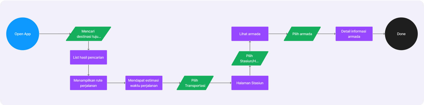
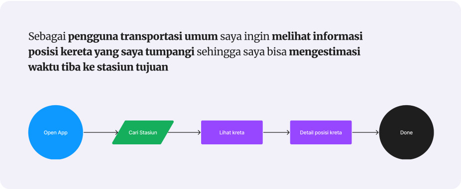
Using the insights gained from empathizing with public transportation users and employing the Jobs To Be Done (JTBD) framework, instead of just looking at what features users want, JTBD looks at the problems they're trying to solve or the goals they're trying to achieve.
Information Architecture (IA)
The next step is to design its information architecture. Information Architecture (IA) refers to the structure and organization of information within the application, ensuring that users can easily find what they need and navigate through the app intuitively.
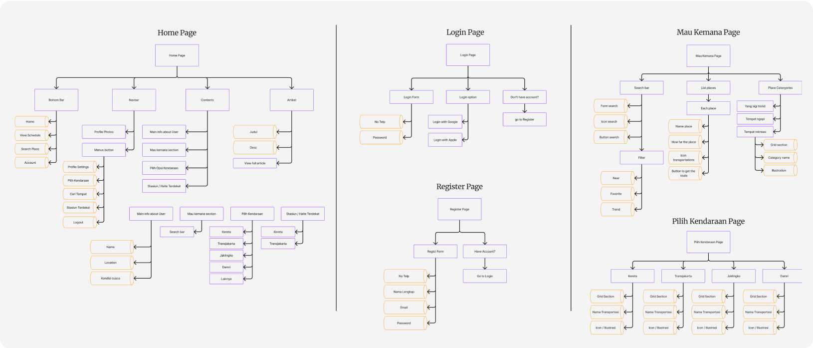
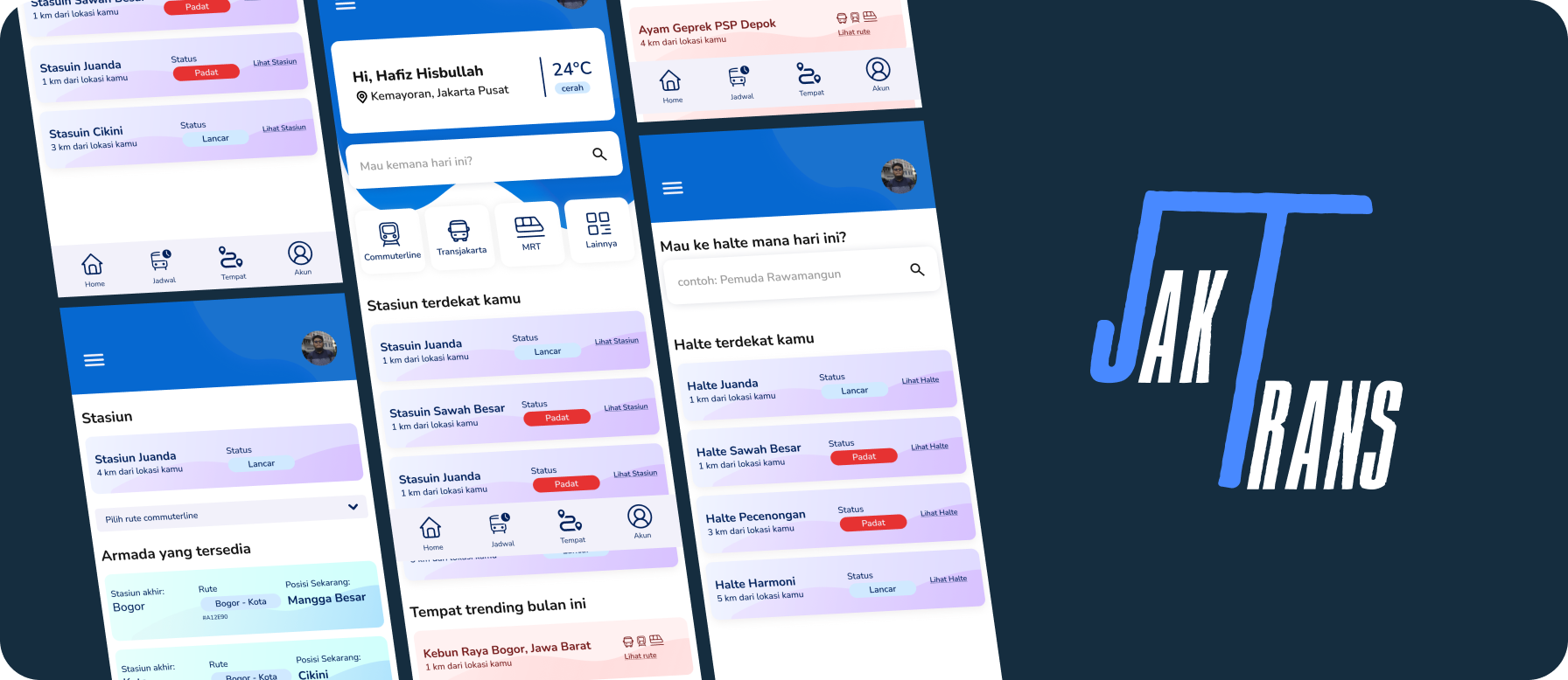
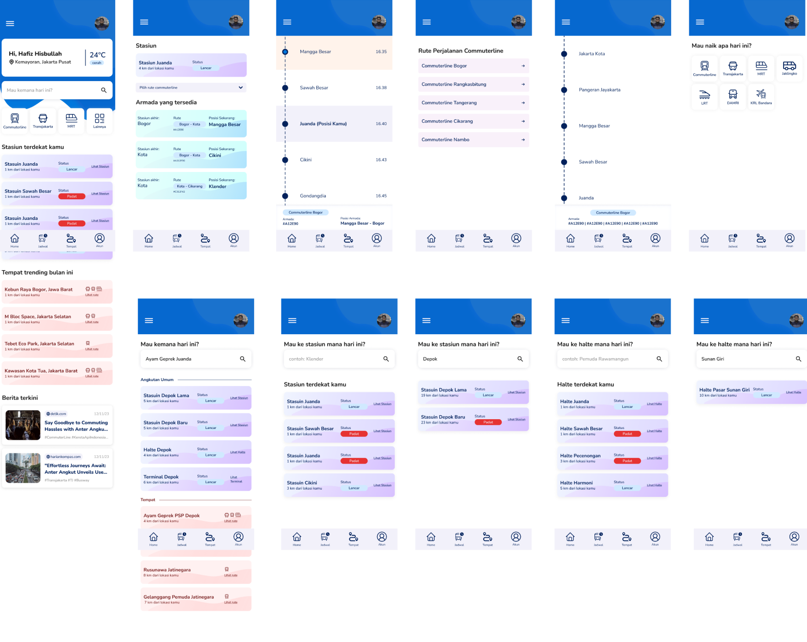
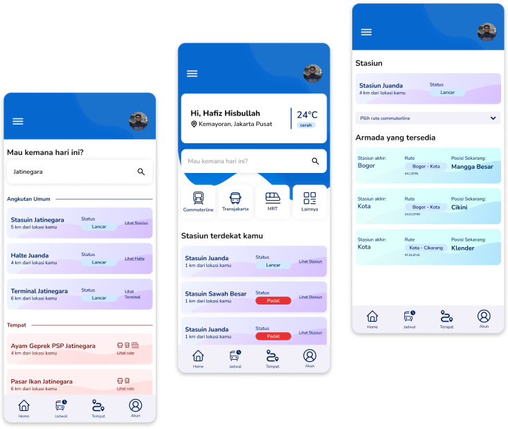
Wireframe
Continuing from the previous discussion on information architecture, the next step in the process is to create wireframes for the application. Wireframes are skeletal outlines that represent the basic structure and layout of each screen or page within the app. Moreover, addressing users' frustrations with the fragmentation of multiple transportation apps, the wireframes will demonstrate how different features and functionalities are integrated seamlessly within the application. This may include showing how users can access ticket purchasing, real-time updates, and trip planning tools from a unified interface.
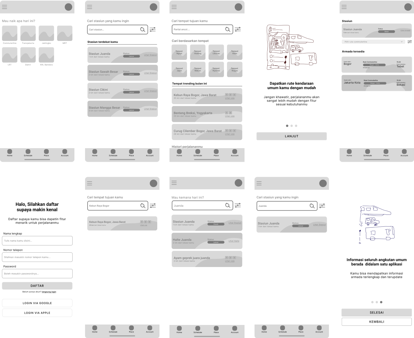
By creating wireframes that align closely with the prioritized features, information architecture, and user needs identified earlier in the process, designers can effectively communicate the layout and functionality of the application before proceeding to the visual design phase.
Tone of Voice
Given the user-centric approach and insights gained from empathizing with public transportation users, the tone of voice in UX writing will be Clear, Formal, Respectful, and Enthusiastic. It will aim to create a sense of trust and reliability while also being approachable and easy to understand.

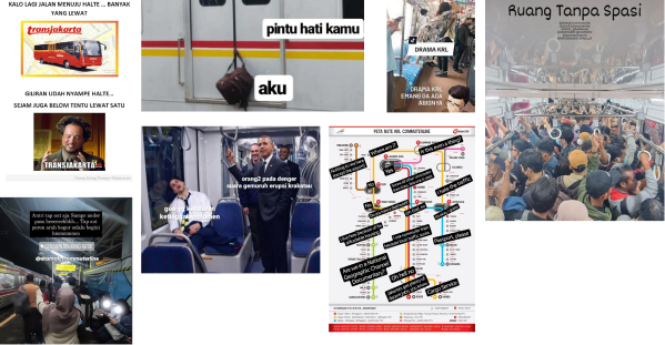
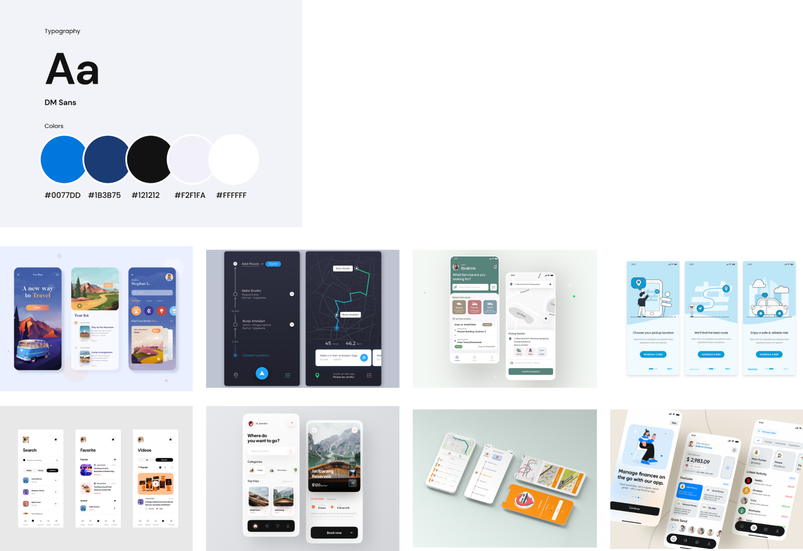
Moodboard for inspiration
A mood board is a visual representation of the overall aesthetic, style, and mood that the application aims to convey. It serves as a reference point for designers, helping them to establish a cohesive visual identity and design language for the app. By creating a mood board that reflects the desired aesthetic and mood for the application, designers can ensure that the visual design elements contribute to a positive and engaging user experience, ultimately enhancing the usability and effectiveness of the public transportation schedule app.
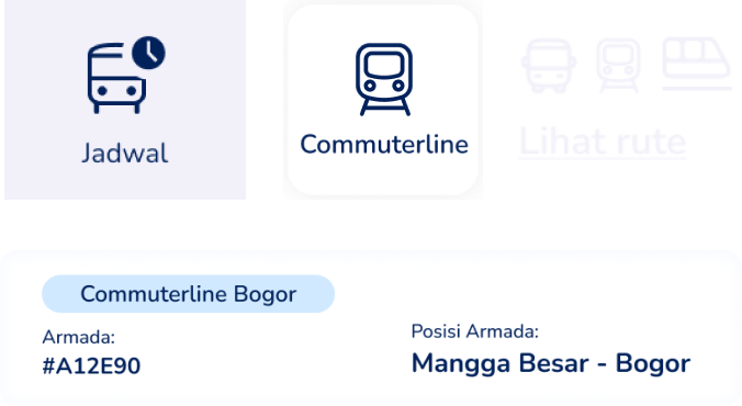
The UI Solution
Continuing from the previous stages of the design process, it's crucial to prioritize a clean design for the public transportation schedule application. A clean design is essential because it simplifies the user interface, making it easier for users to access transportation information without feeling overwhelmed or confused by cluttered visuals.
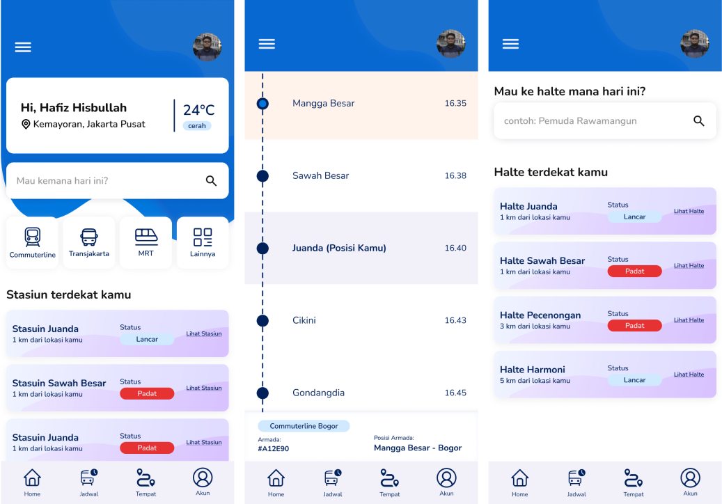
By keeping the design clean and uncluttered, users can quickly find the information they need, such as route options, schedules, and types of transportation. Clear navigation and intuitive layout ensure that users can easily navigate between different features and functionalities without getting lost or frustrated.
Design Elements
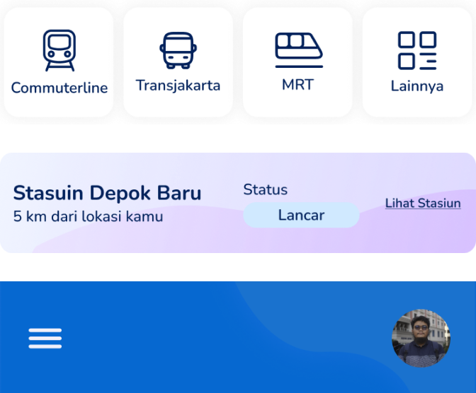
Creating simple and clean design components ensures user comfort and understanding. Clear elements like buttons and icons make functionality obvious, while consistency across the interface aids navigation. Minimalist design reduces visual clutter, allowing users to focus on essential tasks. This approach enhances usability, making it easier for users to achieve their goals and fostering satisfaction with the application.
Style Guide
A style guide serves as a reference document that outlines the visual and branding guidelines to maintain consistency across the application. This includes defining margins, padding, grid systems, and component sizing to ensure a harmonious visual hierarchy and user interface.
The style guide will encompass various aspects of the application's design, including typography, color palette, iconography, spacing, and layout. Each element will be carefully selected to reflect the desired aesthetic and mood established earlier in the process, aligning with the needs and preferences of public transportation users.
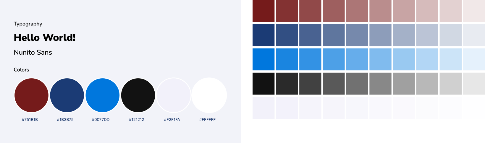
The color palette will incorporate colors that evoke reliability, efficiency, and user-friendliness, as identified in the mood board. Iconography will be intuitive and universally understood, aiding navigation and communication of key concepts.
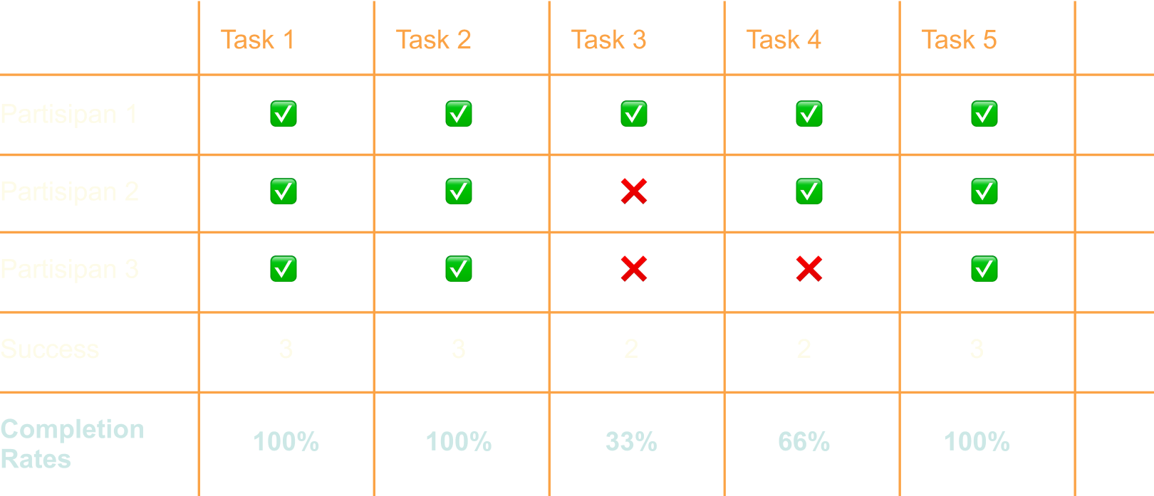
Usability testing for validate design
To validate the designs that have been created, I conducted usability testing with several individuals. The candidates I selected were different from those involved in the initial user research. This approach aims to avoid bias, as their expectations of the application may differ. By involving a diverse group of participants in the usability testing phase, I can gather more comprehensive feedback and insights into how the design performs in real-world scenarios. This allows me to identify any usability issues, areas for improvement, or unexpected user behaviors that may not have been apparent during the design process. Ultimately, usability testing helps ensure that the final design meets the needs and expectations of a broader range of users and delivers a more effective and user-friendly experience.
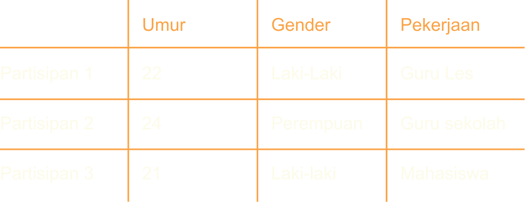
Participant Profiles
I obtained three sample participants for the usability testing, all aged approximately 21 to 25 years old. I believe this age range will provide a sample of public transportation users from the millennial demographic.
Results
The results of the testing I processed are based on the analysis during the session, such as observing users' task performance, identifying any difficulties they encountered, noting the time taken to complete tasks, and recording points of explanation from users (both shortcomings and strengths). I then categorized these findings into several groups, with each category containing a task flow and serving as data points for analysis.
The Good
Overall, the app is pretty good. Like earlier, I could choose the public transportation I wanted to take, and I also found the nearest station from my location. The most important thing is that I could see where the train was located at that moment.
The Bad
In my opinion, the estimated arrival time of the train is crucial. We should be able to see approximately what time the train will arrive at our station. Also, the search bar component on the home screen is ambiguous because it says, 'Where to today?' This means that if I want to go to Bogor station, I should just type 'Bogor,' right? My expectation is that I would then see what types of transportation are available to Bogor station.
Development and Future Work
In conclusion, the UI/UX case for the public transportation application in Jakarta has been a journey of understanding and addressing the diverse needs of users navigating the city's transportation system. Through empathetic user research, thoughtful design decisions, and rigorous testing, we aimed to create an application that simplifies the commute experience for Jakarta's residents and visitors alike.
By prioritizing simplicity, clarity, and efficiency in design, we endeavored to provide users with easy access to essential information such as route options, schedules, and real-time updates. Our goal was to empower users to plan their journeys with confidence and ease, whether they're heading to work, school, or exploring the city.
Throughout the process, we remained committed to fostering a seamless and enjoyable user experience, guided by the principles of user-centric design and continuous improvement. While the journey may have its challenges, we believe that by listening to user feedback, iterating on our designs, and staying true to our mission, we can create a public transportation application that truly serves the needs of Jakarta's diverse community.
Hi, i’m
Muhammad Hafiz HIsbullah 👋
Muhammad Hafiz HIsbullah 👋
Product Design || Frontend Developer
Let's Connect!